")
")


"My Lord,
you ask for my sketches as a friend
but you will use them
as a King"
from my new comic "Leonardo: The dream and the Nightmare" (temporary title)
-
1. The North
"The North" is the first chapter of the comic "We want everything" based on the book of the same name by Nani Ballestrini. The comic does not follow the book literally: Here the first chapter does not correspond to the book's homonymous chapter, but it is a summary of the chapters "South" and... More detail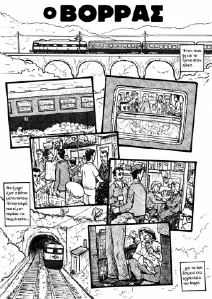
-
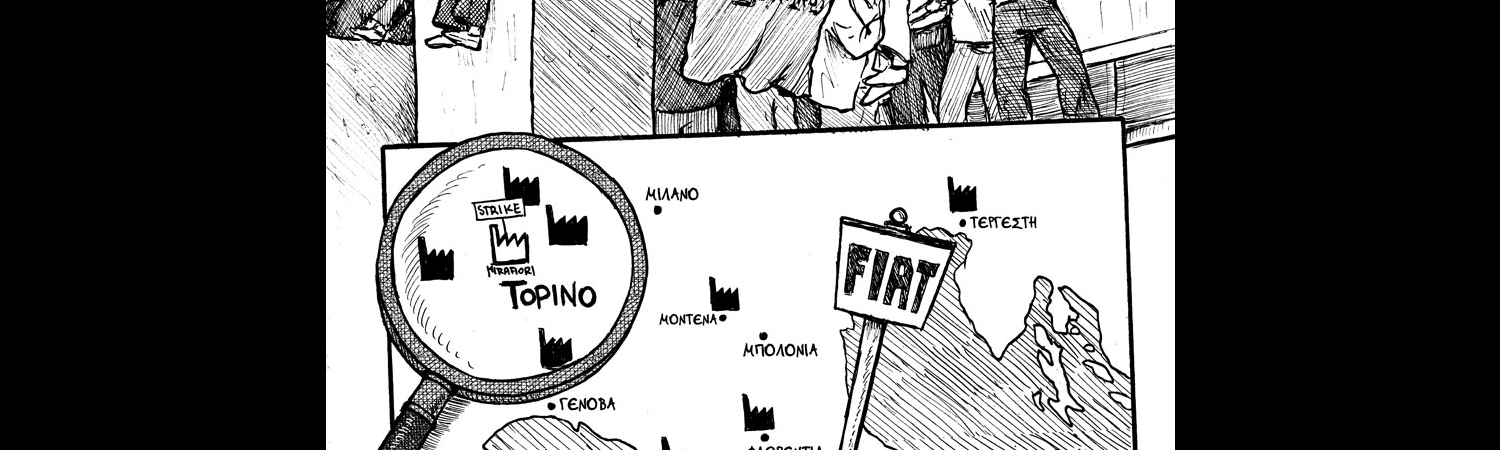
2. The Struggle
The Struggle is the second chapter of the comic We Want Everything based on the book of the same name by Nanni Ballerini (you can see the first chapter, the North, here). In this chapter we watch the first days of the hero in FIAT, his fierce relationship with the hierarchy (foremen,... More detail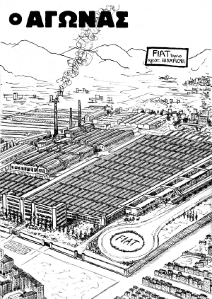
-
3. Autonomy
AUTONOMY is the third chapter of the comic We Want Everything based on the book of the same name by Nanni Ballerini. Beginning this chapter we briefly see the struggles and strikes all the previous days before that Thursday, 29 May (a day narrated in the previous chapter, THE STRUGGLE.)... More detail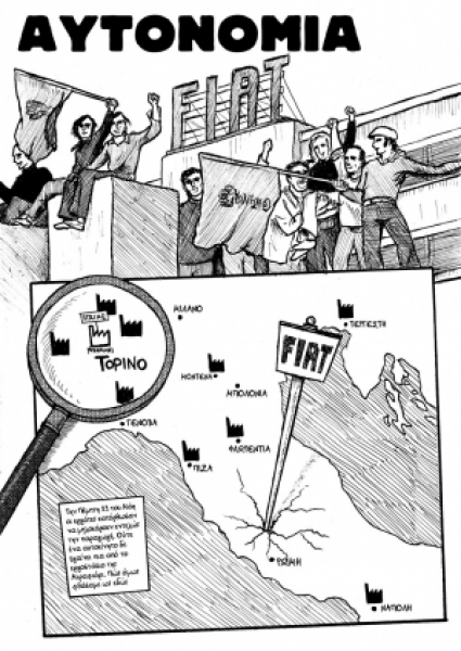
-
4. The Assembly
THE ASSEMBLY is the forth chapter of the comic We want everything based on the book by Nani Ballestrini. In this chapter, we see the assembly (assemblea) of FIAT workers and university students at the weekend and briefly the events before the big demonstration on July 3, 1969 (which will... More detail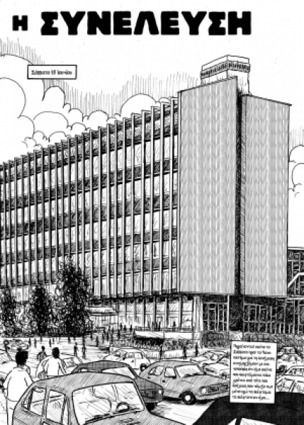
-
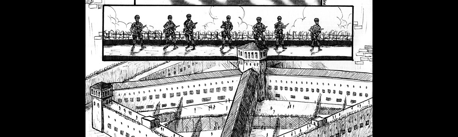
5. Rebellion
REBELLION is the fifth and final chapter (without PROLOGUE and EPILOGUE) of the comic We want everything based on the book of the same name by Nani Ballerini. This chapter, as in the book, tracks the events in Turin on July 3 of '69, in what became known as the Battle of Corso Traiano (la... More detail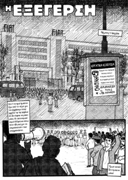
-
Epilogue
A 7th page epilogue of the comic We Want Everything, based on the book with the same name by N. Balestrini. This epilogue tries to summarize what succeeded the events in the comic and resulted in the movement of Autonomia. {gallery}comics/epilogos{/gallery} More detail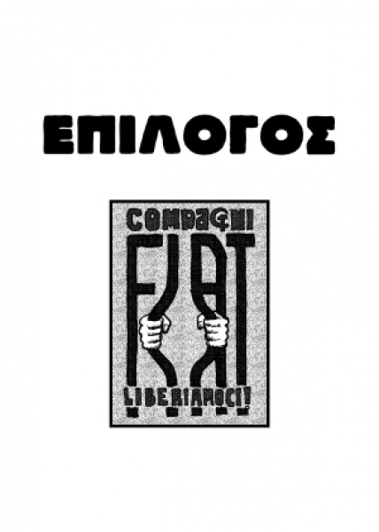
-
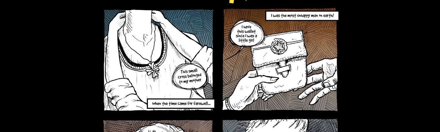
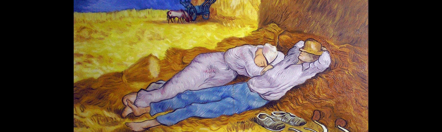
Prologue: Albert's story
This short story comes from Linhart Robert's book "L' ETABLI". Actually, it is the result of the combination of two separate stories of the book (relating to two separate individuals). As they describe in my opinion in a very vivid (but also brief) way the workers' lives both inside and outside... More detail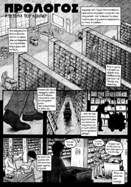
Displaying items by tag: acrylics
This painting is a reproduction of the work The Lovers (II), 1928 by R. Magritte. You can find more about the original painting here.
Apart from any drawing incapacities /differences the two works (original and copy) share a major difference: the colors in my work are more vivid and the transitions are sharper. The first was made deliberately even though the final result on your computer screens is affected by the digitization of the work (photograph and digital corrections).
As for the sharper color transitions the main reason is the use of acrylics instead of oil colors. Perhaps it needed another layer of corrections but I chose to stop here. The result was already satisfying (for a copy made as a study) and my concern and time were already devoted to other works.


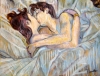
A reproduction of the painting by T. Lautrec. You can find more about the original painting here. A deliberate change here is the use of metallic colors (blues and reds) which resulted in stronger reflections. This is the reason why i added more photos of the painting from different angles.


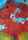
This is a study using mostly different hues of red (and a few blues and greens). I placed the painting in the abstract section although there are some figurative elements in it. In fact the sub title of the image could be "Dragon fight during an eclipse" (an idea given to me before some time).
Unfortunately I found it very difficult to take a proper photograph of the work -so the images on the gallery perhaps are not fully representative of the painting.


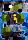
This painting is an abstract study playing with different shades of blue, grey, and green in transparent layers and a finishing touch with solid gold. Among its influences (conscious or not) perhaps one could find mosaics, vitro (stained) glasses, cubism and some works by Klee.


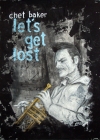
Let's Get Lost is a painting -portrait of Chet Baker based on the poster of the same name (you can see it in the gallery below). Actually my intention wasn't to make a fully detailed portrait but work fast and use transparent layers of white and black along with pastels to make a somewhat more abstract and blurred image.


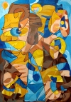
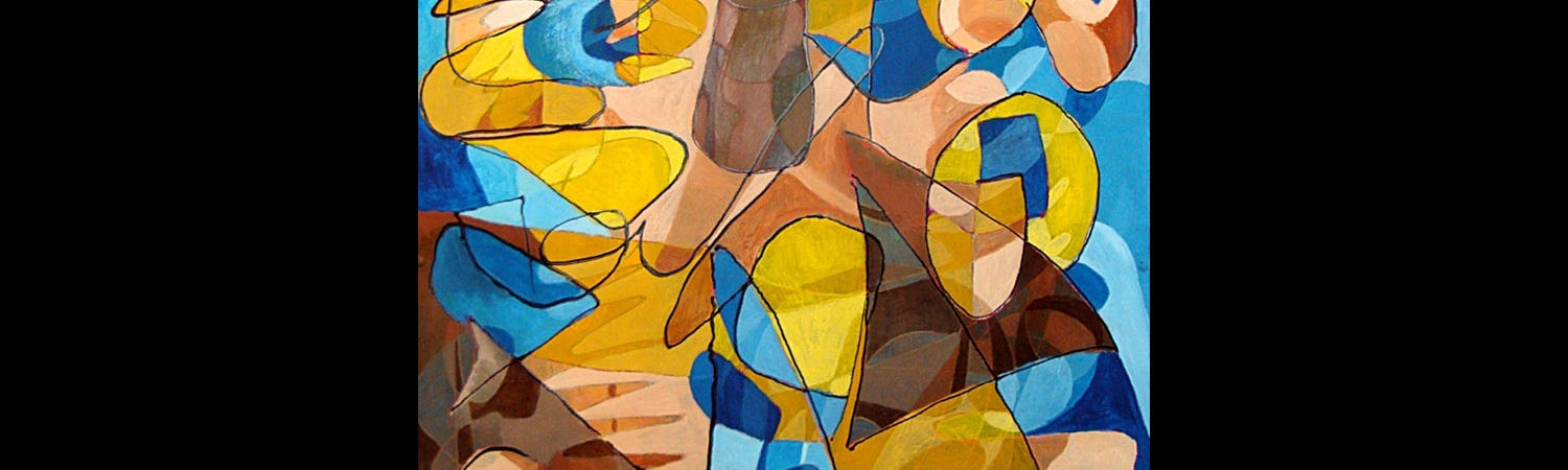
A study playing with forms and four colors. This painting has a similar approach with the one called Study in Pink.
Some dark outlines at the upper segment of the painting were not photographed correctly.
I have included a picture in the gallery that shows the procedure i followed making this work.


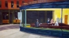
This is a copy of the famous painting Nighthawks, by Edward Hopper. The final result came a bit brighter than the original painting.
The painting was given as a present to a friendly couple.


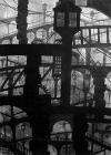
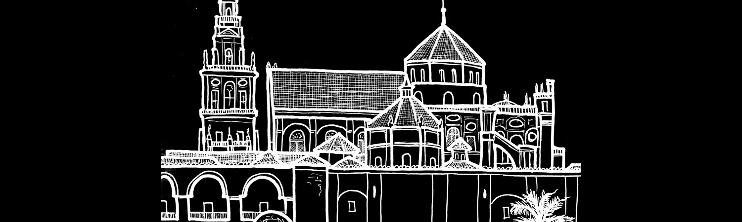
This painting was made as a tribute to the work of Giovanni Battista Piranesi. It shares a lot with the other black and white paintings of 2016 (for example the tower). Here I used some 2d forms inspired by Piranesi's sketches and tried to create a composition. I created debth by decreasing size and opacity.
Unfortunately the photos (and the highlights on the black surfaces) do not do justice to the original work.


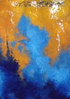
An abstract composition (based on musical divisions 4-6-9) with limited palette and contrasting colors (orange-blue). Its title came to me afterwards perhaps because the final result reminds me of japan paintings.


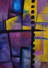
This painting despite its abstract look, has little to do with spontaneity and in fact it was based on a prearranged compositional scheme (that uses the 4-6-9 musical divisions). I wanted to use contrasting colors (hence the mauve/purple -yellow choices) and a limited palette. The final result came a bit darker than the one I wanted.


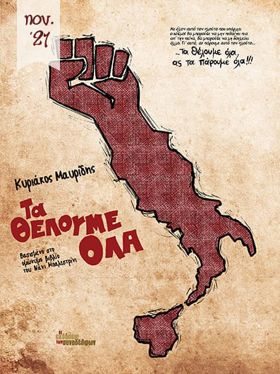
Now in Bookstores
We Want Everything
the publications of colleagues, Nov. 2021
Summer of 1969, Italy. A year after May '68, FIAT workers began a dynamic and unmediated strike against their powerful boss. Their struggle marked the beginning of a decade of workers' and students' mobilizations and the rise of the Autonomy movement. It was characterized by many as the last invasion of the working class into the sky. Last ... let's hope until the next one ...